Analyzing Climate Change Through Data: A Comprehensive Study
Climate change represents a significant consequence of accelerated economic growth.
Conducting a comprehensive analysis of environmental variables is crucial to understanding the extent of climate change and identifying its potential causes. Such analysis will facilitate the development of policies aimed at mitigating and countering the impacts of climate change.

This report examines the complex relationship between temperature anomalies and carbon dioxide (CO2) emissions through the application of data analysis techniques in R. The objective is to identify patterns, trends, and correlations over time to enhance our understanding of the phenomenon of climate change.
Part 1: Unraveling Temperature Anomalies
1.1 Journey into the Past: Analyzing Historical Data
The term temperature anomaly means a departure from a reference value or long-term average. A positive anomaly indicates that the observed temperature was warmer than the reference value, while a negative anomaly indicates that the observed temperature was cooler than the reference value.
Let’s start by delving into historical temperature anomalies data from 1880 to 2016 sourced from NASA’s Goddard Institute for Space Studies.
tempdata <- read.csv("NH.Ts+dSST.csv", skip = 1, na.strings = "***")Code Explanation:
This code imports the dataset into the project for further analysis.
NOTE: The average temperature during the period 1951-1980 is taken as the base temperature and all anomalies are measured from this base temperature.
plot( tempdata$Year, tempdata$Jan,
      xlab="Year", ylab="Anomaly",
      main="January Anomaly variation over years", type="l")

abline(h = 0, col = "darkorange2", lwd=2)
text(2000, -0.1, "1951-1980 average")
Code Explanation:
This R code plots the variation of January temperature anomalies over years and adds a horizontal line at zero, indicating the baseline, and a text annotation indicating the average temperature range for the years 1951-1980.
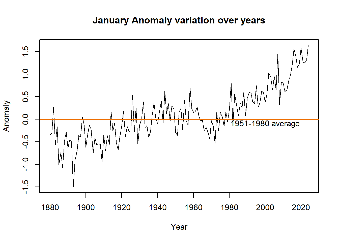
Charts like the one above, help us visualize the data and spot patterns more easily.
Seasonal Averages as a Metric
We employ the provided seasonal averages within the data to enhance the analysis set and to achieve a precise understanding of the results and patterns.
The attention now moves to plotting seasonal averages. The average temperature anomalies each season are graphed throughout time, providing a comprehensive view of climate patterns.
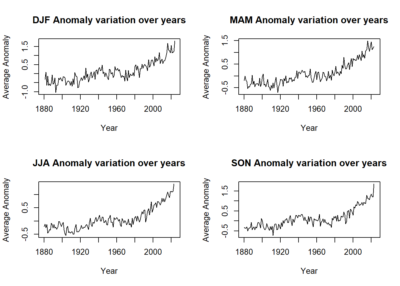
column = c("Jan", "Feb", "Mar", "Apr","May", "Jun", "Jul", "Aug", "Sep", "Oct", "Nov", "Dec","JD","DN" ,"DJF", "MAM","JJA","SON")

par(mfrow = c(2, 2))

for(i in 15:length(column)){
  yaxis = column[i]
  plot(tempdata$Year, tempdata[[yaxis]],
       xlab="Year", ylab="Average Anomaly",
       main=paste(column[i], "Anomaly variation over years"), type="l")
}
Code Explanation:
This code iteratively generates plots for different anomaly types over the years, arranging them in a 2x2 grid. It loops through the "column" vector, plotting each anomaly type against years, with the title reflecting the specific anomaly type being visualized.
Annual Averages as a Metric
An annual perspective provides a comprehensive view of temperature anomalies over time, enabling the identification of overall trends and patterns. It offers valuable insights into the cumulative effects of seasonal variations on global temperatures.
plot(tempdata$Year, tempdata$J.D,
     xlab="Year", ylab="Average Annual Anomaly",
     main= "Average Annual Anomaly variation over years", type="l")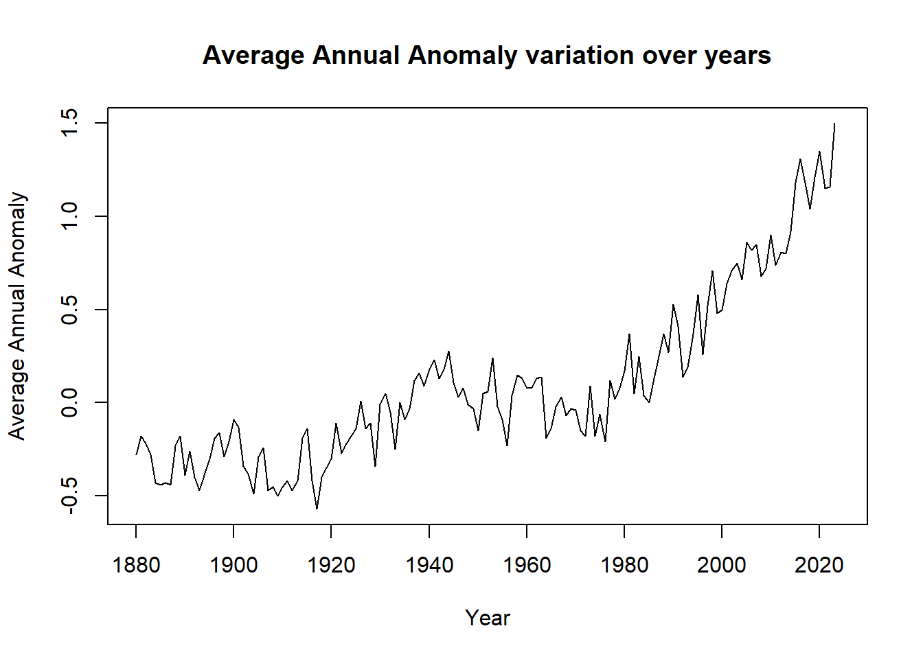
The graph indicates a consistent increase in temperature anomalies over time, primarily above the baseline. This trend is attributed to the ongoing rise in both three-month average anomalies and annual average temperature anomalies.
plot(tempdata$Year, tempdata$J.D,
     xlab="Year", ylab="Average Annual Anomaly",
     main= "Average Annual Anomaly variation over years", type="l")
Code Explanation:
This chunk of code produces a line chart illustrating the variation of average annual temperature anomalies over the years. The horizontal axis represents time (years), while the vertical axis displays the average annual temperature anomaly.
It becomes clear that various time intervals provide distinct insights into temperature patterns. Monthly graphs offer detailed views but frequently neglect the impact of seasonal changes. On the other hand, concentrating exclusively on seasons may obscure the variability present across regions with unique seasonal characteristics.
Therefore, it is essential to examine all potential scenarios to obtain an accurate understanding of the situation.
1.2 Temperature Patterns: Understanding Distribution Over Time
In the preceding section, we focused on visualizing the data to extract insights. Moving forward, we will conduct a comprehensive study by grouping and analyzing the data across different time periods.
In this section, we examine temperature distributions across different time periods by employing statistical techniques, including frequency tables and histograms, to derive meaningful insights.
Frequency Distribution Analysis
We commence by dissecting temperature anomalies into frequency distributions, facilitating a granular examination of temperature patterns.
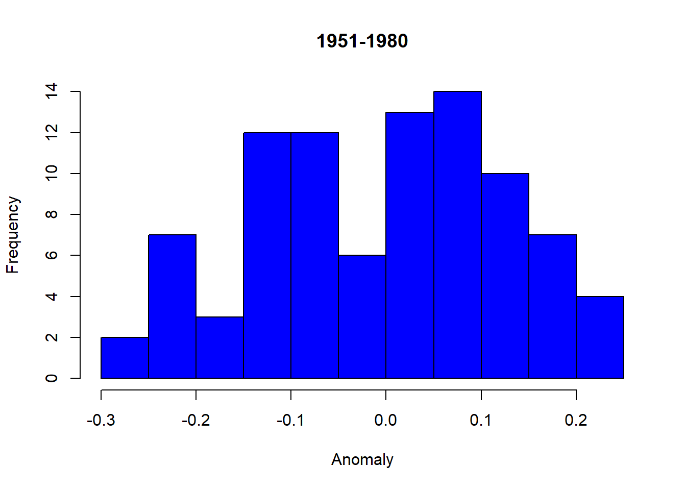
The histograms provide a visual comparison that illustrates the change in the distribution of temperature anomalies over time. Specifically, the left-skewed distribution for the period “1951-1980” indicates lower temperature anomalies, whereas the right-skewed distribution for “1981-2020” suggests higher temperature anomalies, thereby signifying a warming trend over the years.
tempdata$Period <- factor(NA, levels = c("1921-1950", "1951-1980", "1981-2020"), ordered = TRUE)
tempdata$Period[(tempdata$Year > 1920) & (tempdata$Year < 1951)] <- "1921-1950"
tempdata$Period[(tempdata$Year > 1950) & (tempdata$Year < 1981)] <- "1951-1980"
tempdata$Period[(tempdata$Year > 1980) & (tempdata$Year < 2021)] <- "1981-2020"
temp_summer <- c(tempdata$Jun, tempdata$Jul, tempdata$Aug)
temp_Period <- c(tempdata$Period, tempdata$Period, tempdata$Period)
temp_Period <- factor(temp_Period, levels = levels(tempdata$Period))
Code Explanation:
This code snippet categorizes the temperature anomalies data into two periods, "1951-1980" and "1981-2020". It then creates a combined vector, temp_summer, containing the monthly temperature anomalies for June, July, and August across both periods.
hist1 = hist(temp_summer[temp_Period == "1951-1980"], main = "1951-1980", xlab = "Anomaly", ylab = "Frequency")
hist2 = hist(temp_summer[temp_Period == "1981-2020"], main = "1981-2020", xlab = "Anomaly", ylab = "Frequency")
Code Explanation:
Using this combined vector and the corresponding period categories, it generates two histograms representing the frequency distribution of temperature anomalies for the periods "1951-1980" and "1981-2020".
Decile Analysis

Decile analysis serves as a powerful tool, segmenting data into ten equal parts to illuminate trends and patterns. Here, we delve into the depths of temperature dynamics, employing decile analysis to discern nuances in temperature distributions over time.
In descriptive statistics, the term “decile” refers to the nine values that split the population data into ten equal fragments such that each fragment is representative of 1/10th of the population. In other words, each successive decile corresponds to an increase of 10% points that the 1st decile or D1 has 10% of the observations below it. Then, the 2nd decile, or D2, has 20% of the observations below it, and so on.
What is the necessity of conducting decile analysis?
Temperatures within the 1st to 3rd decile are classified as ‘cold,’ whereas those in the 7th to 10th decile are classified as ‘hot.’
To determine the specific temperature values that fall into the ‘hot’ and ‘cold’ categories, it is essential to divide the data into deciles. This process allows for a comprehensive understanding of temperature variations across different time periods.

temp <-
temp_all_5180 <- subset(tempdata, (Year>=1951 & Year <= 1980))
temp51_80 <- unname(unlist(temp_all_5180[,2:13]))

n <- length(temp51_80)
for (j in 1:(n - 1)) {
  for (i in 1:(n - j)) {
    if (temp51_80[i + 1] < temp51_80[i]) {
      temp <- temp51_80[i]
      temp51_80[i] <- temp51_80[i + 1]
      temp51_80[i + 1] <- temp
    }
  }
}
decile <- c()
for (i in 1:10) {
  decile[i] = i*(n+1)/10
}

dec3 <- temp51_80[floor(decile[3])] + (decile[3] - floor(decile[3])) * (temp51_80[ceiling(decile[3])] - temp51_80[floor(decile[3])])

dec7 <- temp51_80[floor(decile[7])] + (decile[7] - floor(decile[7])) * (temp51_80[ceiling(decile[7])] - temp51_80[floor(decile[7])])
Code Explanation:
Data Isolation: We extract temperature data from 1951 to 1980, focusing our analysis.
Vector Creation: All temperature anomalies within this period are consolidated into a vector, temp51_80.
Sorting Logic: Using a sorting algorithm, we organize temperature anomalies in ascending order for structured analysis.
Decile Calculation: Deciles are computed iteratively using the formula D(x) = (n+1)(x)/10, defining temperature boundaries for each decile.
Interpolation Method: Linear interpolation refines decile values for precise temperature thresholds, ensuring accuracy.
Decile Computation: Temperature values corresponding to the 3rd and 7th deciles are computed, highlighting significant temperature milestones.
## 3rd Decile: -0.1
## 7th Decile: 0.1
These are the values of 3rd and 7th deciles respectively.
Alternate Approach to find Deciles
This approach uses the built-in the quantile function of R. Final results from both the methods are same.
perc <- quantile(temp51_80, c(0.3, 0.7));
p30 <- perc[1]
p70 <- perc[2]
## 3rd Decile: -0.1
## 7th Decile: 0.1
Hot Anomaly Percentage
We will now analyze the prevalence of hot temperature anomalies during the period 1981-2010.
temp_all_8110 <- subset(tempdata, (Year>=1981 & Year <= 2010))
temp81_10 <- unname(unlist(temp_all_8110[,2:13]))
n <- length(temp81_10)
for (j in 1:(n - 1)) {
for (i in 1:(n - j)) {
if (temp81_10[i + 1] < temp81_10[i]) {
temp <- temp81_10[i]
temp81_10[i] <- temp81_10[i + 1]
temp81_10[i + 1] <- temp
}
}
}count <- 0
for (i in 1:n){
if(temp81_10[i]>p70) {
count <- count + 1
}
}
percentage <- (count/n)*100Code Explanation:
Data Extraction: We extract temperature data from 1981 to 2010 and store it in the vector temp81_10.
Data Sorting: Temperature anomalies within temp81_10 are sorted in ascending order using a bubble sort algorithm to ensure organized data.
Anomaly Counting: By iterating through the sorted anomalies, we tally instances where temperatures exceed the 70th percentile threshold for hot anomalies, contributing to the count variable.
Percentage Calculation: Using the count of hot anomalies and the total number of temperature observations, we compute the percentage of hot anomalies, providing insights into warming trends.
## Percentage of Hot temperatures: 84.72222
Our analysis indicates that from 1981 to 2010, elevated temperatures accounted for 84.72% of temperature anomalies.
This notable rise compared to the previous period highlights the escalating effects of climate change, emphasizing the need for comprehensive mitigation and adaptation strategies.
Insights Through Numbers: Statistical Summaries
Concluding our analysis, we compute statistical summaries, including mean and variance, to quantify temperature variability across different time periods.
library(mosaic)
mean_DJF <- round(mean(~DJF|Period,data = tempdata),4)
mean_MAM <- round(mean(~MAM|Period,data = tempdata),4)
mean_JJA <- round(mean(~JJA|Period,data = tempdata),4)
mean_SON <- round(mean(~SON|Period,data = tempdata),4)
var_DJF <- round(var(~DJF|Period,data = tempdata),4)
var_MAM <- round(var(~MAM|Period,data = tempdata),4)
var_JJA <- round(var(~JJA|Period,data = tempdata),4)
var_SON <- round(var(~SON|Period,data = tempdata),4)
Code Explanation:
To calculate the mean and variance of temperature anomalies across different seasons and periods, we utilized the mosaic package in R. After loading the package, we extracted data from the tempdata dataset and computed the mean and variance for each season (DJF, MAM, JJA, SON) within each period.
## Mean [DJF] : -0.0337 -0.0027 0.6662
## Mean [MAN] : -0.0483 3e-04 0.659
## Mean [JJA] : -0.0603 3e-04 0.5327
## Mean [SON] : 0.0743 -0.001 0.586
## Variance [DJF] : 0.0571 0.0508 0.1546
## Variance [MAM] : 0.0312 0.0253 0.1404
## Variance [JJA] : 0.0213 0.0145 0.1098
## Variance [SON] : 0.0281 0.0263 0.168
Upon comparing the variability of anomaly temperatures across different periods, we observed a notable increase in variability during the later period (1981–2010) compared to earlier periods (1951–1980 or 1921–1950) across most seasons. Particularly, temperature anomalies in DJF exhibited significantly higher variance compared to JJA, with the variance in DJF approximately three times larger than that in JJA, especially until 1980. However, from 1981–2010, the variability in JJA temperature anomalies began to increase, indicating a shift in temperature patterns over time.
PART 2: Carbon Emissions Analysis
2.1 Exploring CO2 Emissions
Temperature anomalies are not the sole parameter by which climate change can be assessed. We investigate additional parameters to gain a comprehensive understanding of the patterns observed through anomalies data.
Shifting our attention to carbon dioxide emissions, we undertake a concurrent analysis to examine the relationship between greenhouse gas emissions and temperature anomalies.
co2data <- read.csv("co2data3.csv", na.strings = "***")Code Explanation:
This code imports the dataset into the project for further analysis.
In the data-set, the trend mean mole fraction for each month was determined by eliminating seasonal cycles, with linear interpolation applied for missing values. The interpolated value was computed as the sum of the average seasonal cycle value and the trend value.
CO2 Trends Over Time
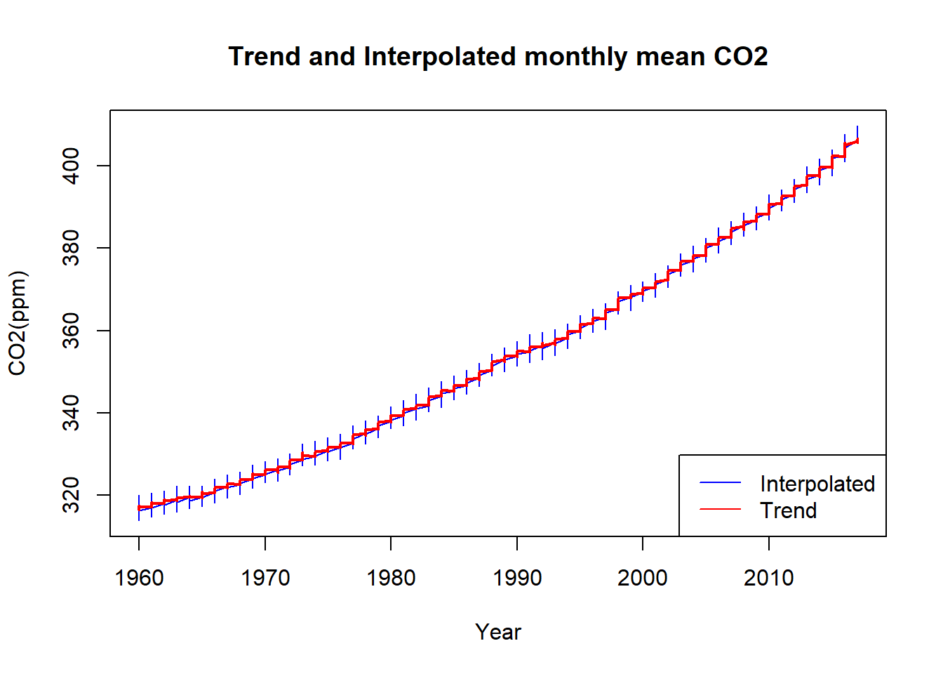
The graph illustrates a clear upward trend in CO2 emissions over the years, with fluctuations occurring within each year, ranging from peak to trough values. This visualization underscores the ongoing increase in CO2 emissions over time, emphasizing the need for concerted efforts to mitigate climate change.
par(mfrow = c(1, 1))
plot(co2data$Year[23:length(co2data$Year)], co2data$Interpolated[23:length(co2data$Year)], type="l",
     xlab="Year", ylab="CO2(ppm)", col="blue", main="Trend and Interpolated monthly mean CO2")

lines(co2data$Year[23:length(co2data$Year)], co2data$Trend[23:length(co2data$Year)], type="l",
      xlab="Year", ylab="CO2(ppm)", col = "red", lwd="2")

legend("bottomright", legend = c("Interpolated", "Trend"), col = c("blue", "red"), lty = 1)
Code Explanation:
- The par(mfrow = c(1, 1)) function sets the plotting area to a single plot.
- The plot() function creates the initial plot using the interpolated CO2 data. It specifies the x-axis as the years from January 1960 onwards and the y-axis as the interpolated CO2 levels. The plot type is set to "l" for a line plot. The x-axis label is set to "Year", the y-axis label to "CO2(ppm)", and the plot title to "Trend and Interpolated monthly mean CO2". The line color is blue.
- The lines() function adds another line to the existing plot, representing the trend CO2 levels. The parameters are similar to the plot() function, with the addition of specifying the line color as red and the line width as 2.
- The legend() function places a legend in the bottom-right corner of the plot, indicating the colors and corresponding labels for the interpolated and trend lines.
Integration with Temperature Data
To investigate the correlation between CO2 emissions and temperature anomalies, we merge the CO2 data with temperature data, concentrating specifically on the month of January. Our methodology includes visual analysis through scatterplots and quantitative assessment using the Pearson correlation coefficient.
trend <- unlist(co2data[5])
month <- unlist(co2data[2])
jan <- c()
n = length(co2data$Year)
for(i in 1:n) {
  if(month[i] == 1) {
    jan <- append(jan,trend[i])
  }
}
Code Explanation:
- We segregate the trend and month values from the CO2 emissions dataset into two separate vectors.
- An empty vector, jan, is defined to store the trend values of January for all years.
- Using a for loop and if statement, we populate the jan vector with the trend values corresponding to January.
This is how, the jan vector looks:
Trend11 Trend23 Trend35 Trend47 Trend59 Trend71

315.70  316.51    317.03    318.06    318.91    319.67
jan <- unname(jan)
zero1 <- rep(0,79)
zero2 <- rep(0,7)
jan <- append(zero1,jan)
jan <- append(jan, zero2)
tempdata$co2trendjan <- jan
Code Explanation:
- The jan vector is adjusted to match the length of the temperature dataset by appending zeros before and after it.
- This ensures that the jan vector aligns with the temperature data period (1959-2017), with zero values for years outside this range.
- A new column, co2trendjan, is created in the temperature dataset (tempdata), incorporating the updated jan vector.
filtered_data <- tempdata[tempdata$co2trendjan != 0, ]

plot(filtered_data$Jan, filtered_data$co2trendjan, xlab= "Anomaly Temperature", ylab="CO2(ppm) Trend",
     pch = 16, col = "blue", main = "Scatterplot for CO2 emmissions and temperature anomalies")
Code Explanation:
- Filtered data is extracted from tempdata to exclude years where the co2trendjan value is zero, ensuring consistency in plotting.
- A scatter plot is generated, with temperature anomalies (x-axis) plotted against CO2 trend values (y-axis).
- The plot is labeled with appropriate axis titles and a title indicating the visual representation.
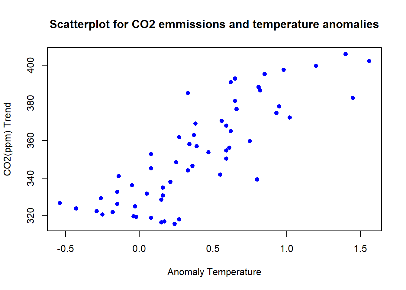
Correlation Analysis
Upon examining the patterns and trends in both CO2 emissions and temperature anomalies data, it becomes apparent that these two datasets may be interrelated and influencing each other. Establishing such a relationship is crucial for a more comprehensive understanding of the factors contributing to climate change.
Concluding our analysis, we quantify the correlation between CO2 emissions and temperature anomalies, employing statistical measures to validate our findings.
The Pearson correlation coefficient measures the degree of linear relationship between two variables, with values ranging from -1 to 1. A correlation of 1 indicates a perfect positive linear relationship, -1 indicates a perfect negative linear relationship, and 0 indicates no linear relationship.
correlation = cor(filtered_data$Jan, filtered_data$co2trendjan,
                  method = "pearson")
Code Explanation:
This code calculates the Pearson correlation coefficient between the values in the Jan column of the filtered_data data frame and the co2trendjan column of the same data frame.
The "method = "pearson" argument specifies that the Pearson correlation coefficient should be calculated. The result is stored in the correlation variable and then printed to the console using the print function.
Pearson Correlation Coefficient: 0.829783
The Pearson correlation coefficient is 0.82, indicating a strong positive linear association between the two variables. When CO2 levels increase, temperatures increase.
Conclusion
In this detailed study, we’ve explored the complicated world of climate change, breaking down how temperature changes and carbon emissions are connected. By carefully analyzing data and using creative ways to visualize it, we’ve highlighted the rising trends and significant impacts of global warming. With this knowledge, we can better tackle the issues of climate change and aim for a sustainable future for the next generations.