Measuring Inequality: Lorez Curves And Gini Coefficients
A central issue in economics concerns how output (equivalent to income) is distributed across economic agents (e.g., workers, entrepreneurs).
Assessing income inequality boils down in effect to measuring the income gaps between high and low earners. Income inequality implies that the lower-income population receives disproportionately less income than the higher-income population: The larger the disparity, the greater the degree of income inequality.
Inequality can be viewed from different perspectives, all of which are related. Most common metric is Income Inequality, which refers to the extent to which income is evenly distributed within a population.
Gini coefficient is a typical measure of income inequality. The coefficient varies between 0 and 1, with 0 representing perfect equality and 1 perfect inequality.
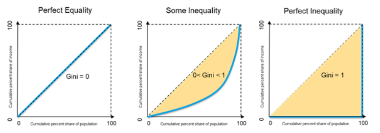
The Gini coefficient measures income concentration at each percentile of the population.
1. Measuring Income Inequality
1.1 Visualizing Income Distribution
One way to visualize the income distribution in a population is to draw a Lorenz curve.
The graph plots percentiles of the population on the horizontal axis according to income or wealth and plots cumulative income or wealth on the vertical axis.
NOTE: For this project, we will use income decile data from Global Consumption and Income Project.
Income here refers to market income, which does not take into account taxes or government transfers
decile_data <- read_excel("GCIPrawdata.xlsx", skip = 2)Code Explanation:
This code imports the dataset into the project for further analysis.
The decile_data looks something like this:
## # A tibble: 6 × 14
##   Country      Year `Decile 1 Income` `Decile 2 Income` `Decile 3 Income`
##   <chr>       <dbl>             <dbl>             <dbl>             <dbl>
## 1 Afghanistan  1980               206               350               455
## 2 Afghanistan  1981               212               361               469
## 3 Afghanistan  1982               221               377               490
## 4 Afghanistan  1983               238               405               527
## 5 Afghanistan  1984               249               424               551
## 6 Afghanistan  1985               256               435               566
## # ℹ 9 more variables: `Decile 4 Income` <dbl>, `Decile 5 Income` <dbl>,
## #   `Decile 6 Income` <dbl>, `Decile 7 Income` <dbl>, `Decile 8 Income` <dbl>,
## #   `Decile 9 Income` <dbl>, `Decile 10 Income` <dbl>, `Mean Income` <dbl>,
## #   Population <dbl>
To draw Lorenz curves, we need to calculate the cumulative share of total income owned by each decile.
We choose US and China for creating the lorenz curve because one is a developed country whereas other is a country that recently underwent enormous economic changes. We use the data for the years 1980 and 2014.
sel_Year <- c(1980, 2014)
sel_Country <- c("United States", "China")

temp <- subset(
  decile_data,
  (decile_data$Country %in% sel_Country) &
  (decile_data$Year %in% sel_Year))
total_income <- temp[, "Mean Income"] * temp[, "Population"]decs_c80 <- unlist(temp[1, 3:12])
total_inc <- 10 * unlist(temp[1, "Mean Income"])
cum_inc_share_c80 = cumsum(decs_c80) / total_incCode Explanation:
This R code is designed to calculate the cumulative income share of each decile for two selected countries (United States and China) for the years 1980 and 2014.
- el_Year: This variable is a vector containing the years 1980 and 2014.
- sel_Country: This variable is a vector containing the names of the two countries of interest, "United States" and "China".
- temp: This line subsets the original data (presumably a dataset named decile_data) to select only the rows where the country is either "United States" or "China" and the year is either 1980 or 2014.
- total_income: This line calculates the total income for each country in the selected years by multiplying the mean income (per decile) by the population.
- decs_c80: This line extracts the mean income values for each decile for the first row (1980) of the subsetted data.
- total_inc: This line calculates the total income for the first row (1980) by multiplying the mean income (per decile) by 10, as there are 10 deciles.
- cum_inc_share_c80: This line calculates the cumulative income share for each decile in 1980. It does this by taking the cumulative sum of the mean income values for each decile (cumsum(decs_c80)) and dividing by the total income for that year (total_inc) . This gives the proportion of total income held by each decile and all deciles below it.
decs_c14 <- unlist(temp[2, 3:12])
total_inc <- 10 * unlist(temp[2, "Mean Income"])
cum_inc_share_c14 = cumsum(decs_c14) / total_inc
Code Explanation:
This block of code is similar to the previous one but calculates the cumulative income share for the year 2014 for China
decs_us80 <- unlist(temp[3, 3:12])
total_inc <- 10 * unlist(temp[3, "Mean Income"])
cum_inc_share_us80 = cumsum(decs_us80) / total_inc
Code Explanation:
This block of code calculates the cumulative income share for the year 1980 for USA
decs_us14 <- unlist(temp[4, 3:12])
total_inc <- 10 * unlist(temp[4, "Mean Income"])
cum_inc_share_us14 = cumsum(decs_us14) / total_inc
Code Explanation:
This block of code calculates the cumulative income share for the year 2014 for USA
Drawing the Lorenz Curve
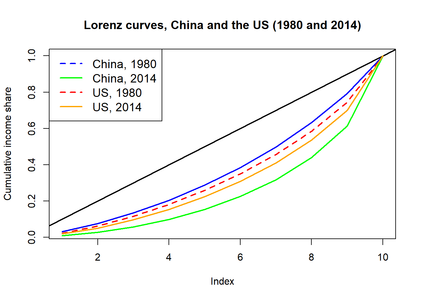
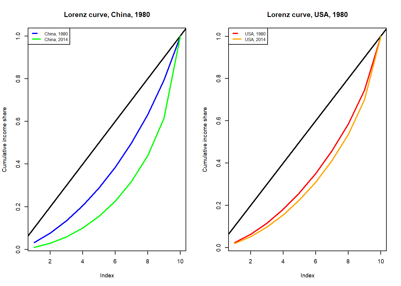
As the chart shows, the income distribution has changed more clearly for China (from the blue to the green line) than for the US (from the orange to the red line).
Code Explanation:
- For China - The Lorenz curve has shifted further from the equality line, indicating a rise in inequality.
- For USA - Similarly, the Lorenz curve for the USA has also moved away from the equality line, showing an increase in inequality.
However, when comparing the degree of change in inequality, the rise in inequality in China over the past 24 years is greater than that in the USA.
In 1980, China had a planned economy focused on equality. Since 1978, reforms aimed at marketization and efficiency have been implemented. This rapid growth has reduced equality, creating private gain opportunities. Rapid growth in China has come at the cost of rising inequality.
1.2 Gini Coefficient
The Gini coefficient, ranging from 0 (equality) to 1 (inequality), measures income distribution. It is the ratio of the area between the Lorenz curve and the equality line to the total area under the equality line. Greater distance from the equality line indicates higher inequality and a higher Gini coefficient.
Calculating Gini Coefficient
library(ineq)
g_c80 <- Gini(decs_c80)
g_c14 <- Gini(decs_c14)
g_us80 <- Gini(decs_us80)
g_us14 <- Gini(decs_us14)
Code Explanation:
The Gini() function from the ineq package is used to calculate the Gini coefficient for each dataset. The resulting coefficients (g_c80, g_c14, g_us80, and g_us14) quantify the level of income inequality for each respective dataset and time period.
## [1] "China - 1980: 0.29 , 2014: 0.51"## [1] "United States - 1980: 0.34 , 2014: 0.4"The Gini coefficients for both countries have risen, corroborating the observations from the Lorenz curves that indicate a growing disparity in income distribution in both nations.
1.3 Analyzing Global Income Inequality: Calculating Gini Coefficients for All Countries
In this section, we examine the global context of income inequality by calculating Gini coefficients for several countries. This analysis provides insights into the different levels of economic disparity across various regions worldwide.
decile_data$gini <- 0
noc <- nrow(decile_data)
for (i in seq(1, noc)){
  decs_i <- unlist(decile_data[i, 3:12])
  decile_data$gini[i] <- Gini(decs_i)
}
Code Explanation:
This code snippet processes each row of the *decile_data* dataframe, where each row signifies a country's income distribution. In each iteration, it calculates the Gini coefficient for the income distribution using the **Gini()** function from the **ineq** package. The computed Gini coefficient is then stored in a new column named *gini* within the decile_data dataframe. This ensures that the Gini coefficient is calculated for each country and appended to the dataframe for further analysis.
##    Min. 1st Qu.  Median    Mean 3rd Qu.    Max.
##  0.1791  0.3470  0.4814  0.4617  0.5700  0.7386
The average Gini coefficient is 0.46, the maximum is 0.74, and the minimum 0.18
Countries closet to Income Equality
Identifying countries with the lowest income inequality is essential. It reveals the effectiveness of socioeconomic policies and highlights nations with higher social cohesion, economic stability, and well-being. These countries can serve as benchmarks for policymakers aiming to reduce global income disparities. Studying their strategies helps develop targeted interventions for regions with greater inequality. Furthermore, showcasing these countries promotes discussions on best practices and encourages knowledge-sharing for more equitable economic systems.
## # A tibble: 17 × 3
##    Country          Year  gini
##    <chr>           <dbl> <dbl>
##  1 Bulgaria         1987 0.191
##  2 Czech Republic   1985 0.195
##  3 Czech Republic   1986 0.194
##  4 Czech Republic   1987 0.192
##  5 Czech Republic   1988 0.191
##  6 Czech Republic   1989 0.194
##  7 Czech Republic   1990 0.196
##  8 Czech Republic   1991 0.199
##  9 Slovak Republic  1985 0.195
## 10 Slovak Republic  1986 0.194
## 11 Slovak Republic  1987 0.193
## 12 Slovak Republic  1988 0.192
## 13 Slovak Republic  1989 0.193
## 14 Slovak Republic  1990 0.194
## 15 Slovak Republic  1991 0.195
## 16 Slovak Republic  1992 0.196
## 17 Slovak Republic  1993 0.179
These correspond to eastern European countries before the fall of communism.
Observation:
In communist systems, government ownership of production guarantees employment and minimizes economic inequality. Central planning ensures resource distribution, providing jobs and necessities for most citizens. Citizen cooperation enhances resource allocation efficiency. However, drawbacks include limited personal freedoms, potential inefficiencies, and a lack of innovation incentives. Despite its aim to meet basic needs for all, these factors led to the transition away from communism in many countries.
Visualizing Time Series of Gini Coefficients
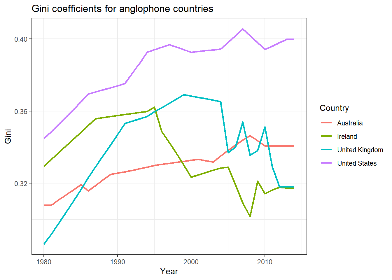 This plot illustrates the variation in economic inequalities in the USA over the past 24 years, influenced by major policy decisions. As a capitalist society, the USA maintains higher levels of inequality compared to other countries.
temp_data <- subset(decile_data, Country %in% c("United Kingdom", "United States", "Ireland", "Australia"))

ggplot(temp_data,
  aes(x = Year, y = gini, color = Country)) +
  geom_line(size = 1) +
  theme_bw() +
  ylab("Gini") +
  # Add a title
  ggtitle("Gini coefficients for anglophone countries")
Code Explanation:
This R code extracts data for the United Kingdom, United States, Ireland, and Australia from the *decile_data* dataframe. It then employs **ggplot()** to generate a plot with Year on the x-axis and Gini coefficient on the y-axis, differentiating each country with distinct colored lines.
2. Other Measures of Income Inequality
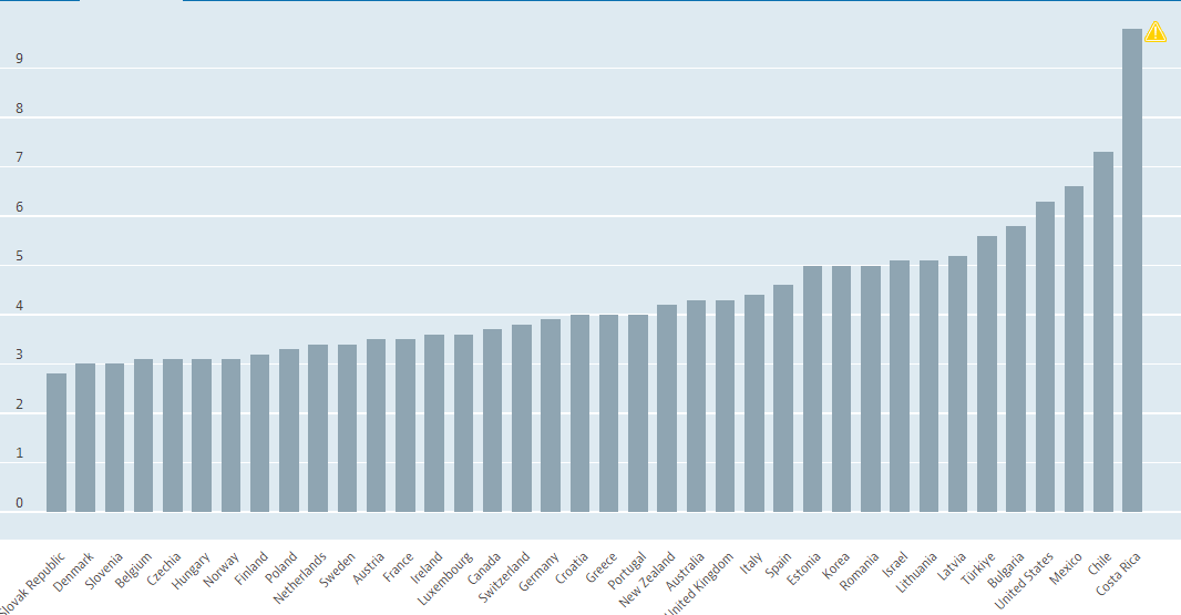
The 90/10 income inequality ratio represents how many times larger income at the 90th percentile is compared with income at the 10th percentile. This is also known as the Interdecile P90/P10.
Dividing the income of workers at the 90th percentile with those of workers at the 10th percentile creates the 90/10 income inequality ratio to demonstrate inequality trends.
Similarly, there are Interdecile P90/950 and Interdecile P50/P10.
P90/P10 plot:
P90/P10 - P90/P50 - P50/P10 on same plot:
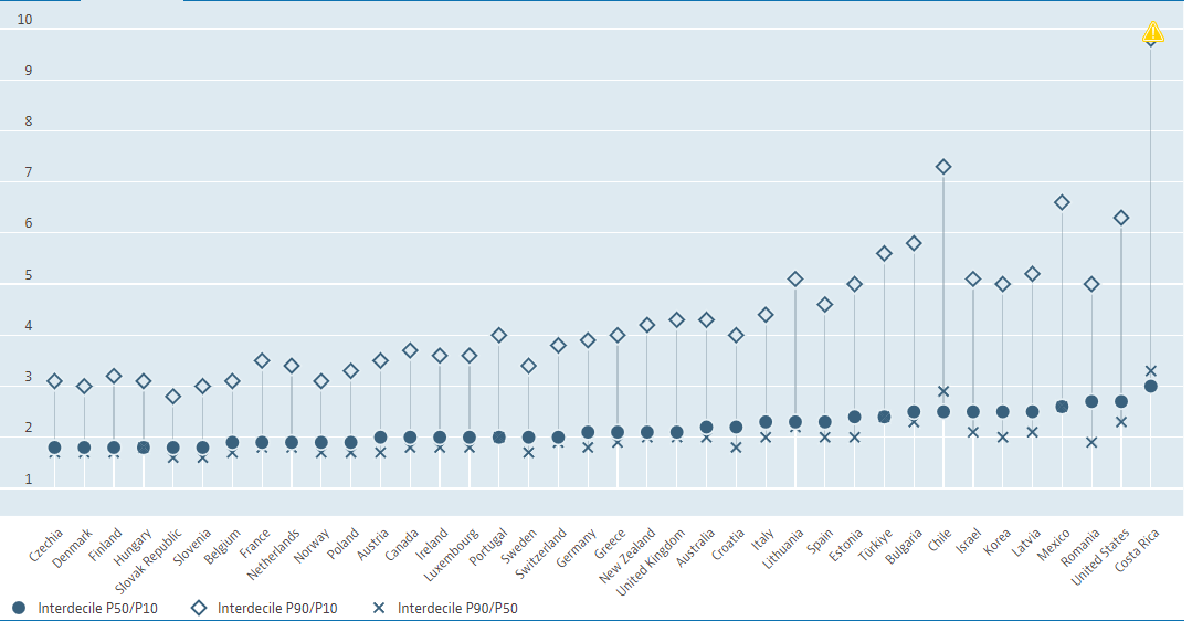
The ratio of the upper bound value of the ninth decile to the median income (P90/P50) and the ratio of the median income to the upper bound value of the first decile (P50/P10) are significant indicators.
Countries that score highly on the Gini coefficient tend to also perform well on these ratio measures. The Gini coefficient, being a comprehensive measure of income distribution, can obscure severe inequalities that exist between specific segments of the population.
3. Capitalism vs Communism for Income Inequality
The shift from communism or socialism to capitalism in various nations offers a fascinating perspective for analyzing the impact of economic systems on income inequality. This section investigates these economic frameworks by employing the Gini coefficient to assess and contrast income distributions across different countries, and it delves into how these systems affect inequality levels.
Capitalism
Capitalism is an economic system where private individuals or businesses own capital goods. Production, distribution, and prices of goods and services are determined by competition in a free market. Income inequality in capitalist economies can be substantial, as market forces reward individuals based on their skills, education, and capital.
Communism
Communism, in contrast, is characterized by state ownership of resources and means of production. The government typically plans and controls the economy, aiming for equal distribution of wealth. In theory, this should result in lower income inequality, although practical implementations often diverge from this ideal.
| Czechoslovakia | 98.8 |
| U.S.S.R | 96.3 |
| Romania | 95.2 |
| German Democratic Republic | 94.7 |
| Hungary | 93.9 |
| Bulgaria | 91.5 |
| Yugoslavia | 78.9 |
| Poland | 70.4 |
| OCED Average | 21.2 |
It can be seen from this table the difference in state employment in the two different types of economies.
3.1 Income Inequality Analysis for different countries
This study examines countries that transitioned from socialist or communist states to open-market economies following the dissolution of the U.S.S.R. in the 1980s. We will investigate how this shift gradually influenced income inequalities within these societies over time.
We use the data-set taken from the book Income, Inequality and Poverty during the Transition from Planned to Market Economy by Branko Milanovi
decile_belarus <- read_excel("deciledata.xlsx",sheet=1)
decile_bulgaria <- read_excel("deciledata.xlsx",sheet=2)
decile_czech <- read_excel("deciledata.xlsx",sheet=3)
decile_hungary <- read_excel("deciledata.xlsx",sheet=4)
decile_latvia <- read_excel("deciledata.xlsx",sheet=5)
decile_poland <- read_excel("deciledata.xlsx",sheet=6)
decile_romania <- read_excel("deciledata.xlsx",sheet=7)
decile_russia <- read_excel("deciledata.xlsx",sheet=8)
decile_ukraine <- read_excel("deciledata.xlsx",sheet=9)
Each decile_(country) contains the all 10 decile values for two different years. This can be visualized as:
## # A tibble: 6 × 3
##   Decile `1988` `1995`
##   <chr>   <dbl>  <dbl>
## 1 First    4.47   3.38
## 2 Second   6.01   5.32
## 3 Third    6.99   6.38
## 4 Fourth   7.89   7.31
## 5 Fifth    8.8    8.3
## 6 Sixth    9.76   9.34
Now, we calculate the Gini Coefficient for both years, using the Gini function of the ineq package.
belarus1 <- unlist(decile_belarus[[2]])
gini_belarus1 <- Gini(belarus1)
belarus2 <- unlist(decile_belarus[[3]])
gini_belarus2 <- Gini(belarus2)
Similarly, Gini’s coefficient is calculated for two different years for all the countries.
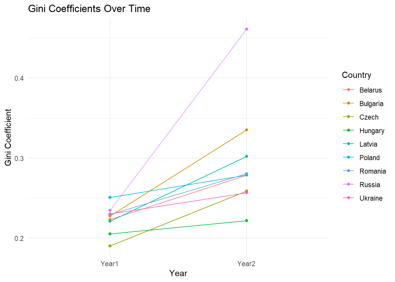
We will use create a line plot to visualize this change in Gini’s coefficient value over the transition years for these countries.
country <- c(rep("Belarus", 2), rep("Bulgaria", 2), rep("Czech", 2), rep("Hungary", 2), rep("Latvia", 2), rep("Poland", 2), rep("Romania", 2), rep("Russia", 2), rep("Ukraine", 2))

year <- c("Year1", "Year2", "Year1", "Year2", "Year1", "Year2", "Year1", "Year2", "Year1", "Year2", "Year1", "Year2", "Year1", "Year2", "Year1", "Year2", "Year1", "Year2")

gini <- c(gini_belarus1, gini_belarus2, gini_bulgaria1, gini_bulgaria2, gini_czech1, gini_czech2, gini_hungary1, gini_hungary2, gini_latvia1, gini_latvia2, gini_poland1, gini_poland2, gini_romania1, gini_romania2, gini_russia1, gini_russia2, gini_ukraine1, gini_ukraine2)

gini_data <- data.frame(country, year, gini)


library(ggplot2)

ggplot(gini_data, aes(x = year, y = gini, group = country, color = country)) +
  geom_line() +
  geom_point() +
  labs(title = "Gini Coefficients Over Time",
       x = "Year",
       y = "Gini Coefficient",
       color = "Country") +
  theme_minimal()
Code Explanation:
This R code creates a line graph using ggplot2 to visualize how Gini coefficients vary over time for multiple countries. It first prepares a data frame (gini_data) containing Gini coefficients by country and year. The plot uses ggplot() with aes() to map years to the x-axis, Gini coefficients to the y-axis, and color codes each country`s data. geom_line() connects data points with lines, geom_point() adds points for clarity, and labs() sets labels and titles. The resulting graph shows trends in income inequality (Gini coefficients) across different countries over two years.
Observation and Conclusion:
U.S.S.R was formally dissolved into various small states and Russia on 26 December 1991.
After the dissolution of the Soviet Union, under the leadership of Boris Yeltsin, the country made a significant turn toward developing a market economy by implanting basic tenets such as market-determined prices.
In October 1991, Yeltsin announced that Russia would proceed with radical, market-oriented reform along the lines of “shock therapy”, as recommended by the United States and IMF. Hyperinflation resulted from the removal of Soviet price controls and the central bank’s policy in the early 1990s.
Along with Russia, several newly formed states saw this as a transition period for going from Socialism/communism to Capitalism. The increase in the Gini coefficient was sharp.
-
As regards poverty, the most unfavorable developments occurred in the countries (Russia, Estonia, Ukraine, Moldova, Bulgaria and Lithuania), where the poorest suffered greater absolute losses than did the middle or top income classes. Because in all these countries, real income decreased by between one-third and one-half, this translated into real income losses of up to two-thirds for the bot om quintile.
-
Inequality in Russia, Ukraine, and the Baltics (in that order) seems to be greater than the OECD average. In Eastern Europe, however, in equality remains distinctly less than the OECD average.
This llustrates the impact of economic transitions on income inequality. The transition from communism to capitalism in Eastern Europe, and Russia, led to increased income inequality.